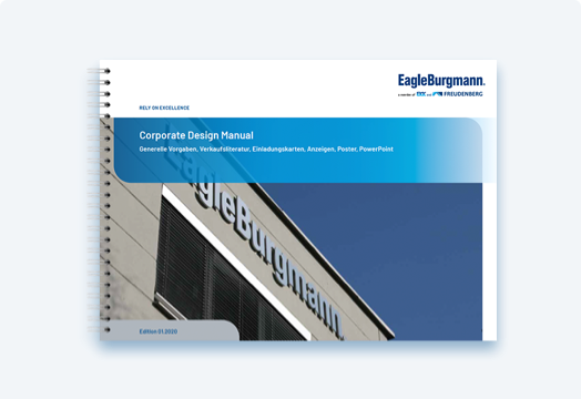
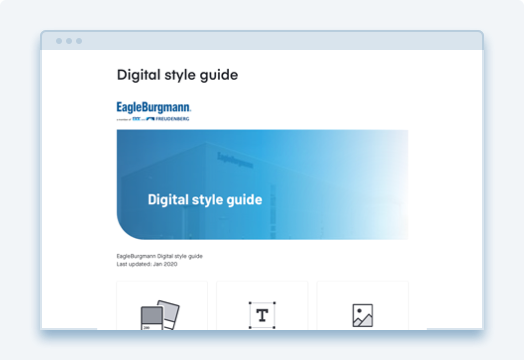
CD manual I
- General Specifications
- Sales Literature
- Invitation Cards
- Advertisements
- Posters
- PowerPoint
With our corporate design guidelines, we ensure a consistent appearance of our company both internally and externally. The style guides must therefore be strictly adhered to worldwide for all defined applications and measures. If in doubt, our colleagues from Strategic Marketing & Communication will be happy to answer any questions you may have at any time.


The logo is the central element of the brand identity and is supplemented with the names of the parent companies. “Rely on excellence” remains our claim, with which we express our promise to our customers. In the future, the claim will be shown offset from the logo.

With the new Barlow font, we are using a font family which gives an impression that is technical and yet open and friendly. The font is centrally installed on all PCs at EagleBurgmann and is available for all typical Office programs. The sharing of presentations with outside parties must exclusively take place as PDFs, including for security reasons. Business stationary, like delivery notes, invoices, business cards etc. remain with font Arial currently used.
The colors are divided into three color groups: Base, neutral and accent colors. EagleBurgmann will also in future present itself to the public as “the blue company”. However, the typical dark-blue is being lightened a touch (this applies not to the logo!), and a fresh turquoise blue will be used more frequently. The yellow tone has also been shifted somewhat toward green and now appears more striking and modern.
The product images are always isolated (without background) and shown with a light shadow.

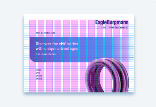
Various background surfaces with “circle corners” and accent shapes reflect the rounding in the design of seals.

Please feel free to get in touch with us if you need any further assistance.